Orlando RV
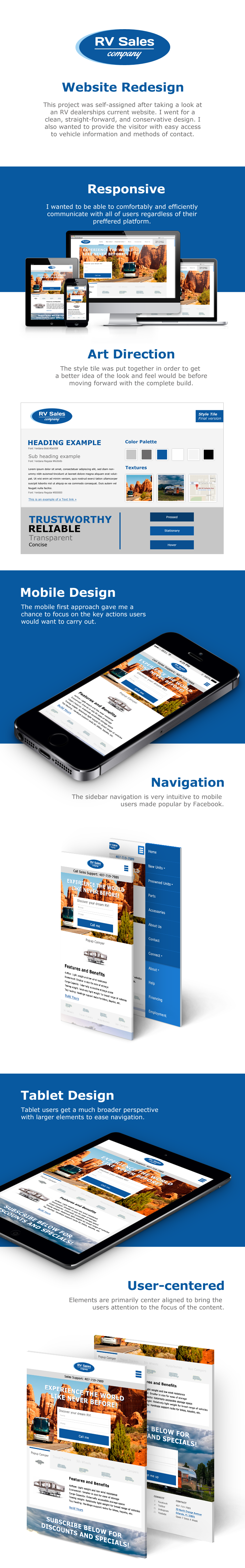
This project was self-assigned after taking a look at Orlando RV's current website. I went for a clean, straight-forward, and conservative design. I also wanted to provide the visitor with easy access to vehicle information and methods of contact.
What problem the project is solving
The original Orlando RV website was very hard on the eyes, with no clear indicators for the product types available. My goal was to create an attractive and easy to navigate interface, with clear calls to action. Big, bold, and beautiful design that evokes a sense of trust and reliability, that is the goal.
How did I do it?
I took a look at the current elements on the live site and looked at easier ways to present the information. There was a lot of wasted space filled with gradients and rolling text effects. I wanted to maximize the screens real estate to immerse the user into an inviting space.
Processes involved
1. Review the current website and pull resources
2. Figure out the target audience
3. Sketch a new layout
4. Build a style tile
5. Design elements
6. Collect feedback from peers
7. Mock up devices versions
8. Present product at interview
End product
The final product was presented at an interview with the owner of the company. He fell madly in love and admitted that my design made him feel bad about his current website.
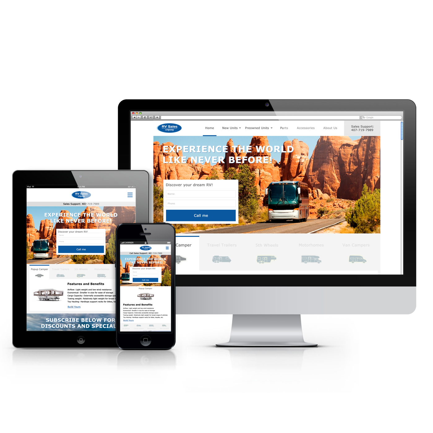
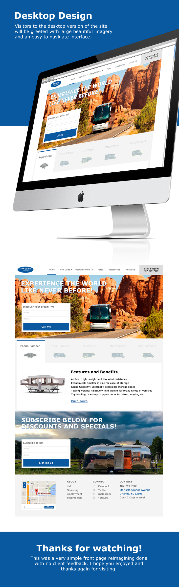
A large hero image, non threatening call to action, and clear indicators of the various RV types available led the charge in this redesign.
A phone number was also included because a large majority of the campers are middle to late aged and still believe in calling in. Those users could not be forgotten, so the call number remained at the top by the navigation.
Separating the RV types into large clickable chunks with basic information on the particular unit type would invite the user to explore. No long, detailed lists to overload the brain with information, just relevant information that invites them to dive deeper and continue shopping.
Summary
I evoked an emotion and that is what good design is meant to do. Make the user feel something, make it easy to navigate, and direct a desired course of action. Feedback was well received and folks were even touching the mock ups on my iPad. They wanted to come in and have an experience, and that is what it's all about.