
Blue Toad
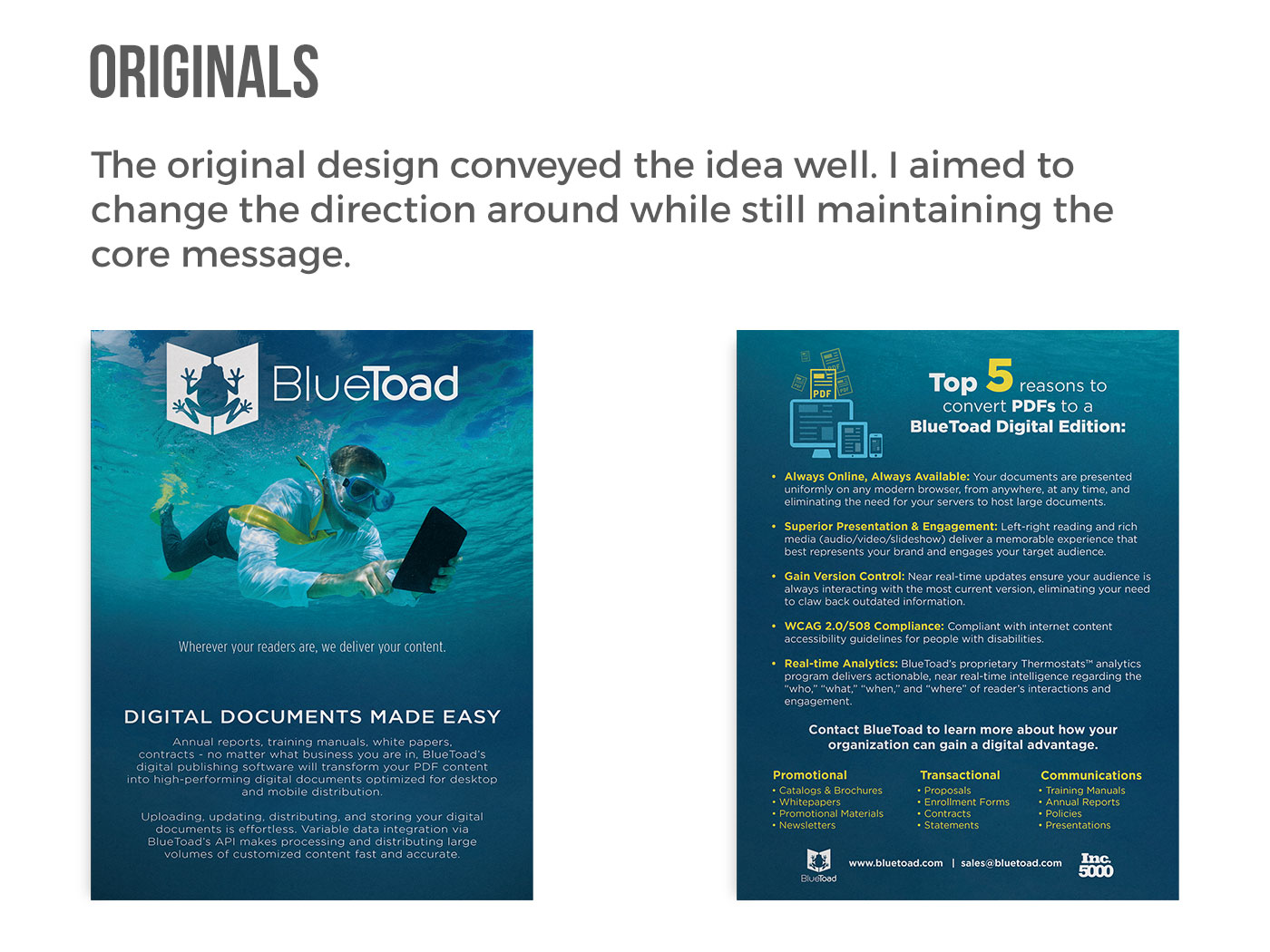
BlueToad reached out to me and wanted my take on a sales collateral design for their digital publication company. The timeline was one week with full creative freedom. The only requirement was that the same copy was included in the redesign.
How did I do it?
I grabbed all of the copy first and thought through how I was going to get all of this to fit. The fonts must be harmonious and also fit within the document. Then I grabbed all assets and started building off of the original.
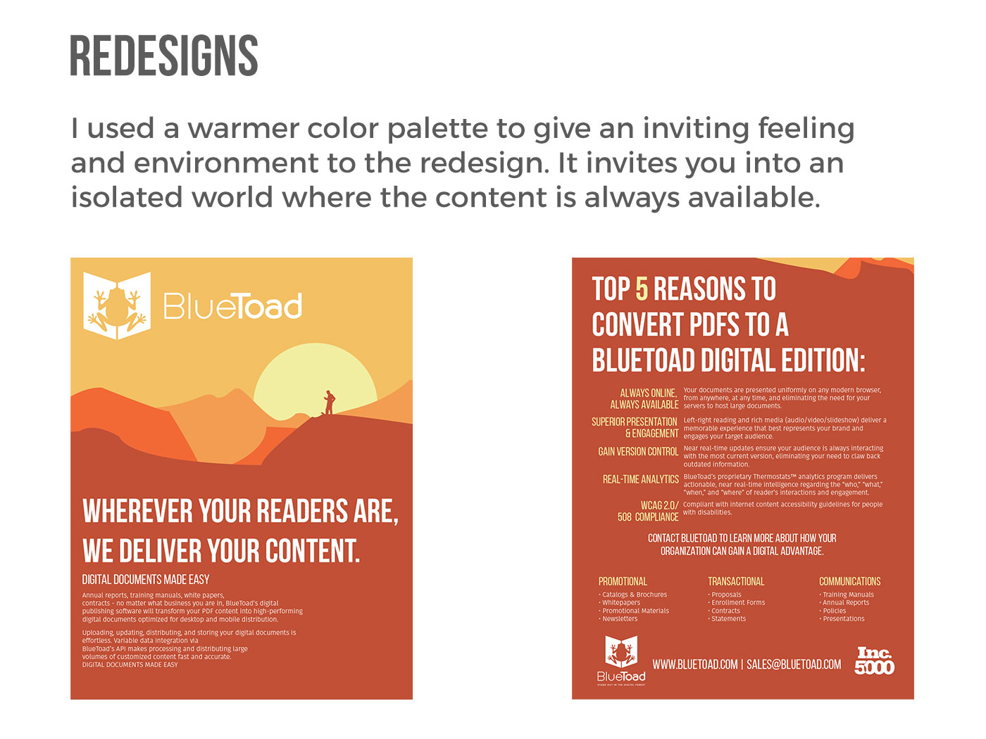
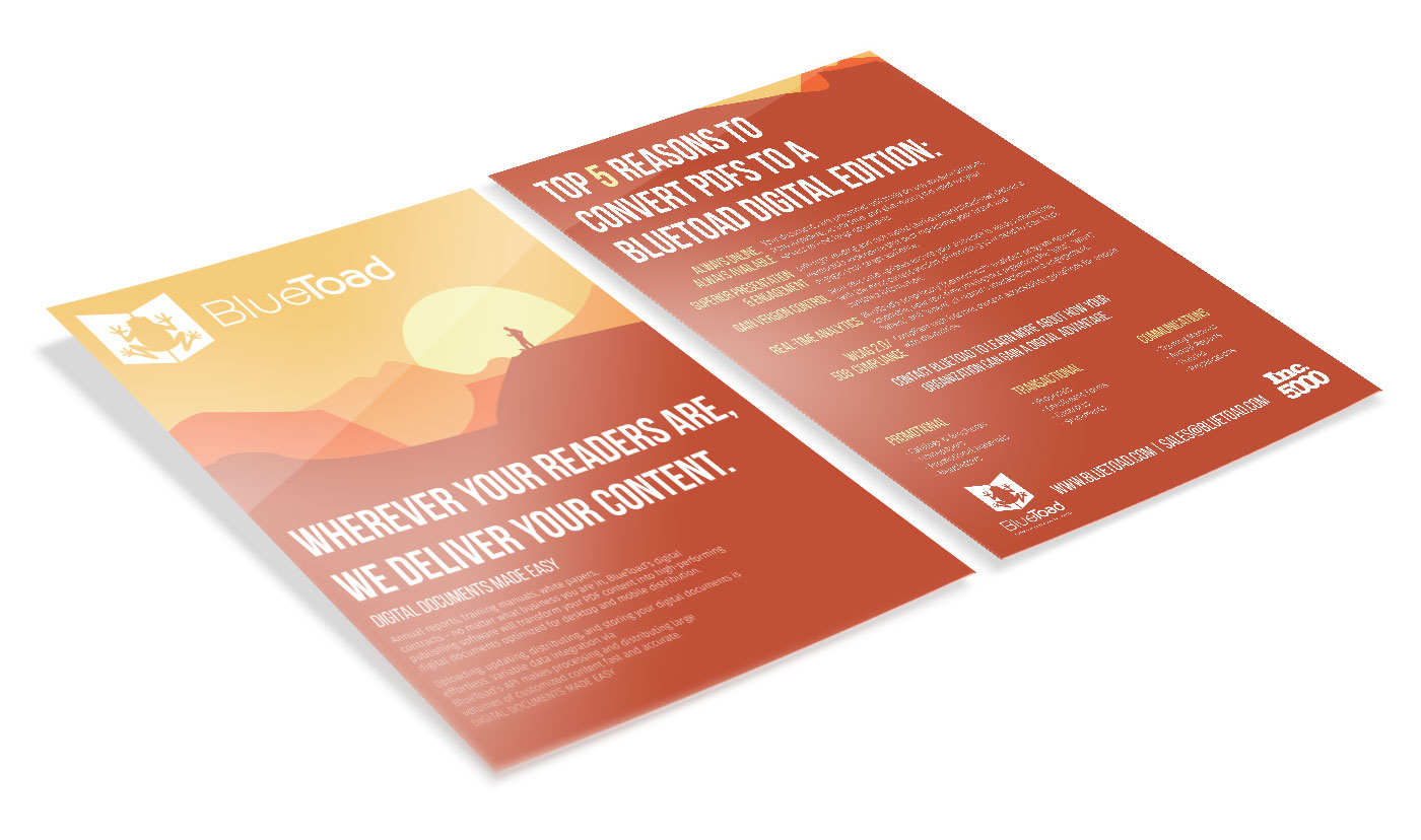
The Process
The biggest challenge in all of this was the amount of copy in this document. The back was clearly more copy heavy, so typography was going to play a huge role on the back. I wanted to use a bold, yet condensed typeface for the headings and an easy to read typeface for the body copy. I ended up using Bebas Neue for the headings and Fira Sans for the body copy which work very well together.
A color palette was chosen and the drawings were done up in Illustrator. The idea was not to go for imagery or intricate illustrations, but rather a simple and easy to digest piece. Feedback was very positive and well received.