
Chase Mobile Application
This was a self-assigned project regarding the User Experience of their mobile banking application. I just love the money transfer feature their app provides, but I found myself accidentally logging out at the end of the process. Why is this? I decided to explore why and come up with a simple solution. Here’s how.
What Problem the project is solving
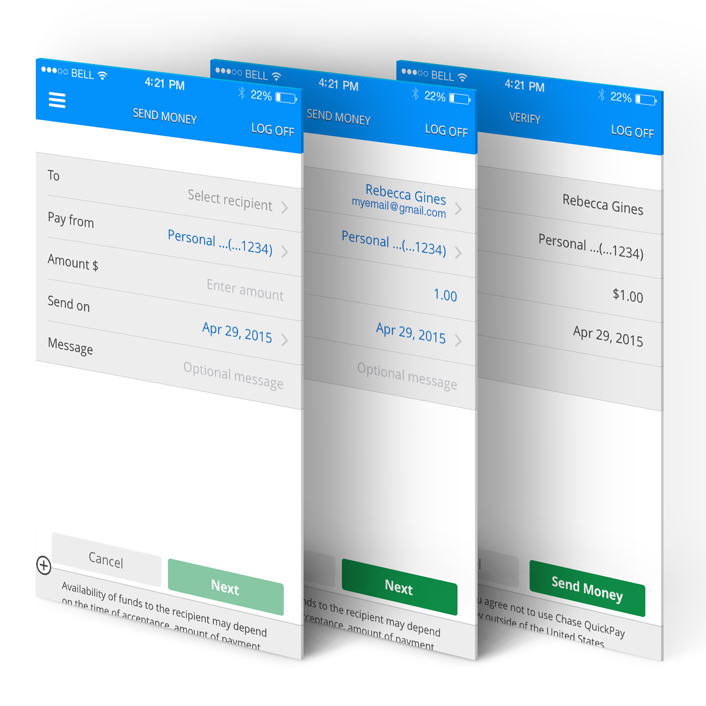
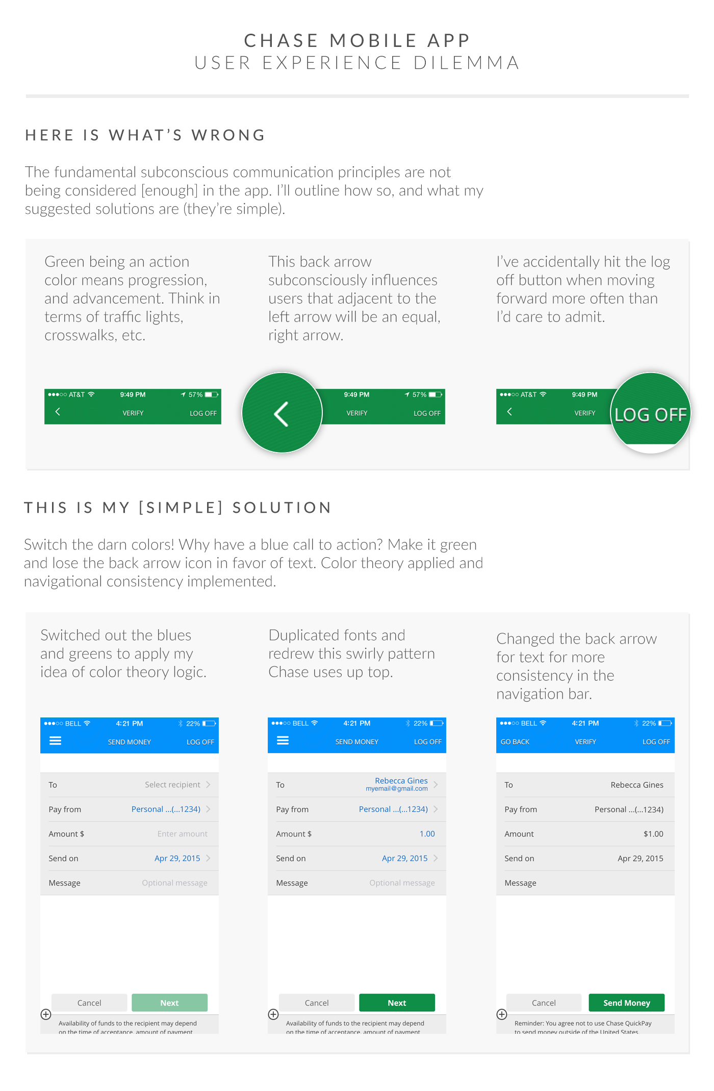
The process is not intuitive enough. How did I come to this? Well I use the feature regularly and I find myself blasting through the process very quickly. I found the 2 design flaws that are the culprit of my dilemma. The major one is the use of a specific icon and the other is the color choice for action items.
How Did I do it?
I began by changing out the back icon at the confirmation page. Why? Because its location implies that there is a forward, or progress icon adjacent to it. That particular field reads left to right, back to front, beginning to end; which is not intuitive at all. It’s also surrounded in a green field which support the notion of progressing, going, and advancing. Instead, there is a “LOG OFF” text field which, without prompt, throws you out of the application and forces you to restart.
Processes involved
1.Figure out the fonts being used
2.Replicate the texture being used
3.Mock up a solution
4.Present an easy solution